imprint DDSG Blue Danube
DDSG Blue Danube Schiffahrt GmbH acts as a passenger shipping company with its headquarters in Vienna within the tourism value chain.
In addition, as a travel agent, services relating to Danube shipping are offered.

IMPRINT
DDSG – BLUE DANUBE SCHIFFAHRT GMBH.
Shipping Center
Handelskai 265
A – 1020 Vienna
Tel.: +43 (1) 588 80-0
E-mail: info@ddsg-blue-danube.at
Share capital: € 1,453,460
Company register number: FN 136917z
Vienna Commercial Court
UID: ATU 39590000
DVR: 0825735
Member of the Austrian Federal Economic Chamber
A company of Wien Holding and VERKEHRSBUEROS.
AUTHORIZED REPRESENTATIVE BODIES
Managing directors
Wolfgang Hanreich, Managing Director & Operations Manager
Wolfgang Fischer, Managing Director
procuration
Fleet captain Johannes Kammerer
Supervisory board
Martin Winkler, MBA, Chairman of the Supervisory Board
Dr. Kurt Gollowitzer, Deputy Chairman of the Supervisory Board
Birgit Wallner, Member of the Supervisory Board
Oliver-John Perry, MSc, Member of the Supervisory Board
Employee representative
Thomas Graner, employee representative
Helga Größ, employee representative
CORPORATE OBJECTIVE
DDSG Blue Danube Schiffahrt GmbH acts as a passenger shipping company with its headquarters in Vienna within the tourism value chain.
In addition, as a travel agent, services relating to Danube shipping are offered.
Explanation of the general direction of the medium
Presentation of offers for Danube cruises
Disclosure obligation in accordance with the amendment to the Media Act, Section 25, Paragraph 2 of the Media Act
Text, editing website: Harald Markl
Text, editing newsletter: Harald Markl
Web design, content management system & support: Harald Markl (DDSG Blue Danube)
Web development: Melanie Breier | m-designworx.com
Graphics: ideenladen | ideenladen.at
Graphics: Manuela Tippl | manuelatippl.at
Photo credits: DDSG Blue Danube, Eva Kelety, dieter-lampl.com, shutterstock.com, iStockphoto.com, Julius Silver, Harald Markl, Chris Rhabek, Philipp Hutter, Andreas Tischler
The content and structure of the DDSG Blue Danube Schiffahrt GmbH website are protected by copyright.
The reproduction of information or data, in particular the use of texts, parts of texts or images, requires the prior written consent of DDSG Blue Danube Schiffahrt GmbH.
Platform for online dispute resolution of the European Commission
The European Commission provides a platform for online dispute resolution (OS), which you can find here https://ec.europa.eu/consumers/odr/.
We are prepared to participate in an out-of-court arbitration procedure before a consumer arbitration board.
You can also submit your complaint directly to us at the following email address: info@ddsg-blue-danube.at
Integration of services and content from third parties
It may happen that third party content, such as videos from YouTube, maps from Google Maps, RSS feeds or graphics from other websites, are integrated into this online offer. This always presupposes that the providers of this content (hereinafter referred to as “third-party providers”) are aware of the IP address of the user. Because without the IP address, you would not be able to send the content to the browser of the respective user. The IP address is therefore required to display this content. We strive to only use content whose respective providers only use the IP address to deliver the content.
However, we have no control over whether the third-party provider saves the IP address for statistical purposes, for example. As far as we know, we will inform users about it.
Ready to go?
Secure your tickets now!
Discover the “Queen among Europe’s rivers” with the DDSG Blue Danube.
The Danube is the most sung about river, it crosses a world cultural heritage, glides majestically between vineyards, breaks through rock massifs, offers imaginative views and a lot of variety.
For the curious and first-time visitors as well as for “repeat offenders” and connoisseurs.
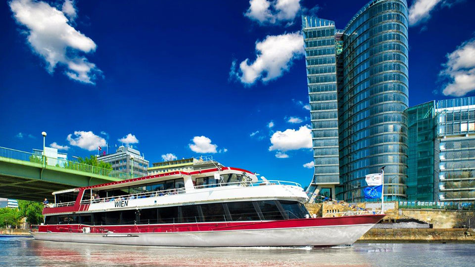
MS_Wien_Grosse_Donaurundfahrt
MSWi
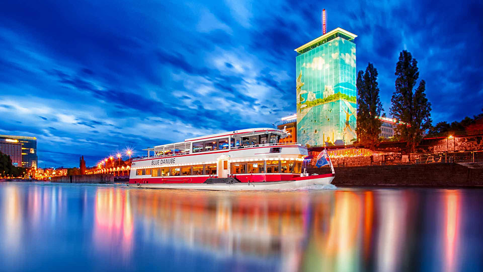
MS_Blue_Danube_Dinner_Cruise
Dinner Cruise oder City Cruise
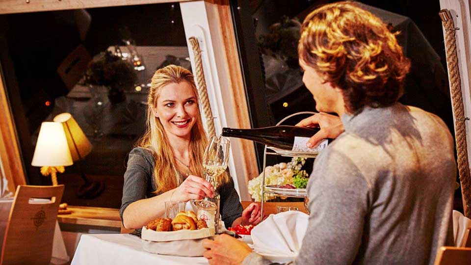
Dinner_Cruise
Entspannte Atmosphäre auf Donauwellen
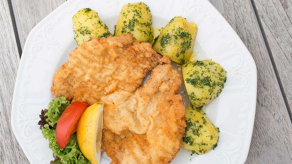
Schnitzel
Schiff + Schnitzel
Vienna_Lunch_Boat
Gemütliche Auszeit am Wasser.
Sonnendeck
Beste Entspannung und schönste Aussicht

Rettungsring_DDSG_Blue_Danube
bei der DDSGBl
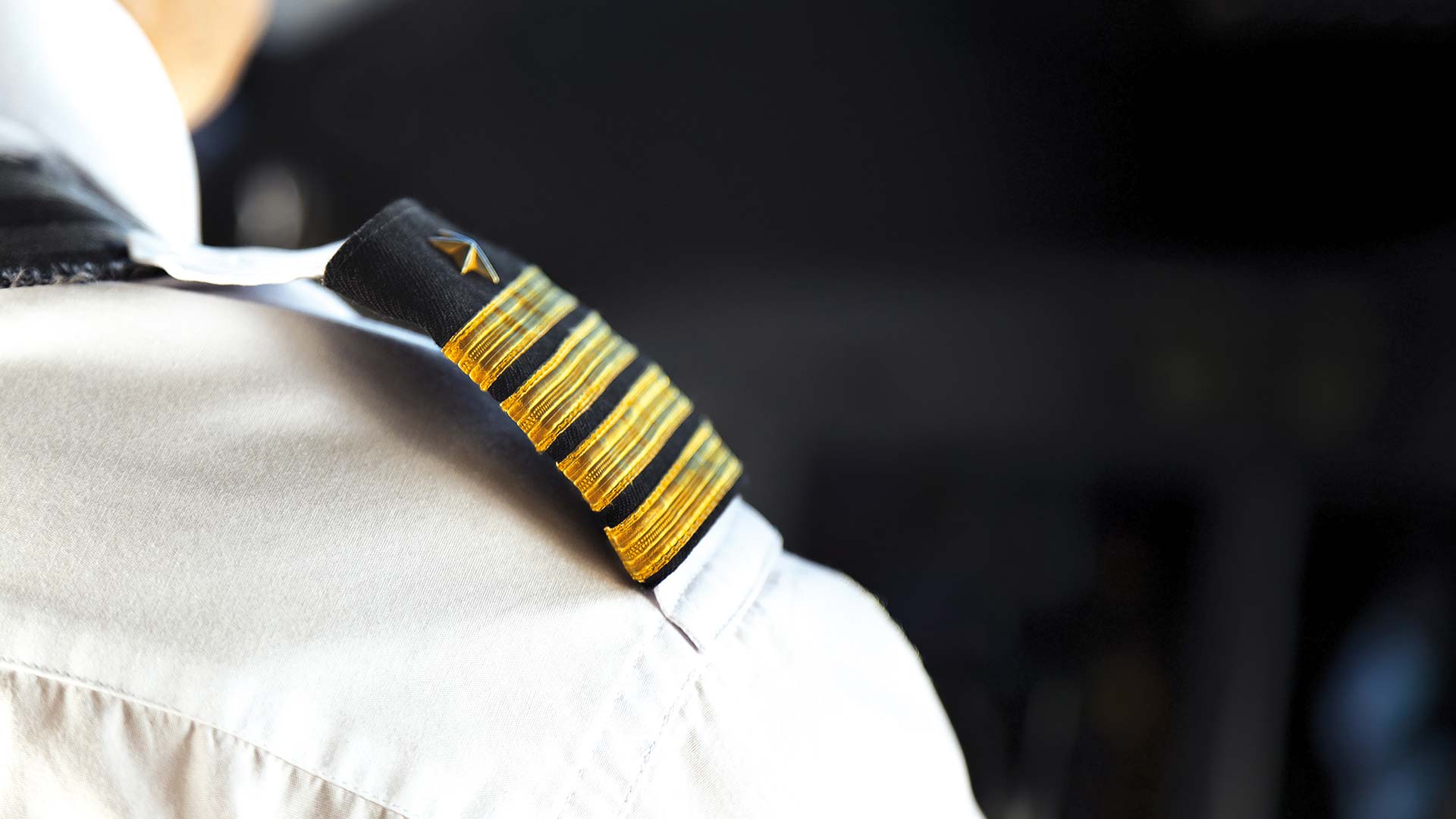
Schulterklappe
Steht Ihnen zur Verfügung. Schiff ahoi!