WEDDING ON THE SHIP
WEDDING IN VIENNA
MS VIENNA, MS VINDOBONA, MS BLUE DANUBE
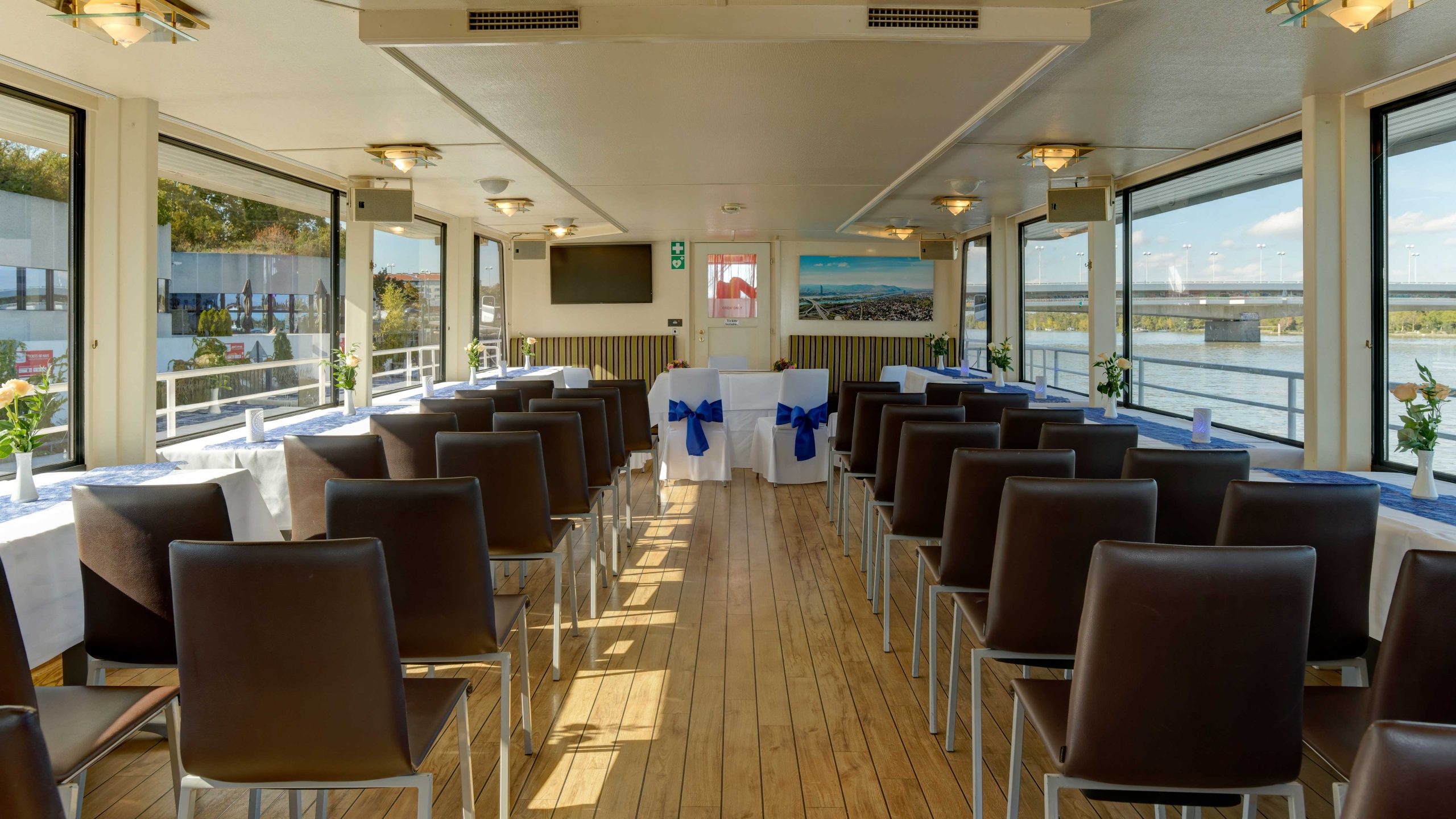
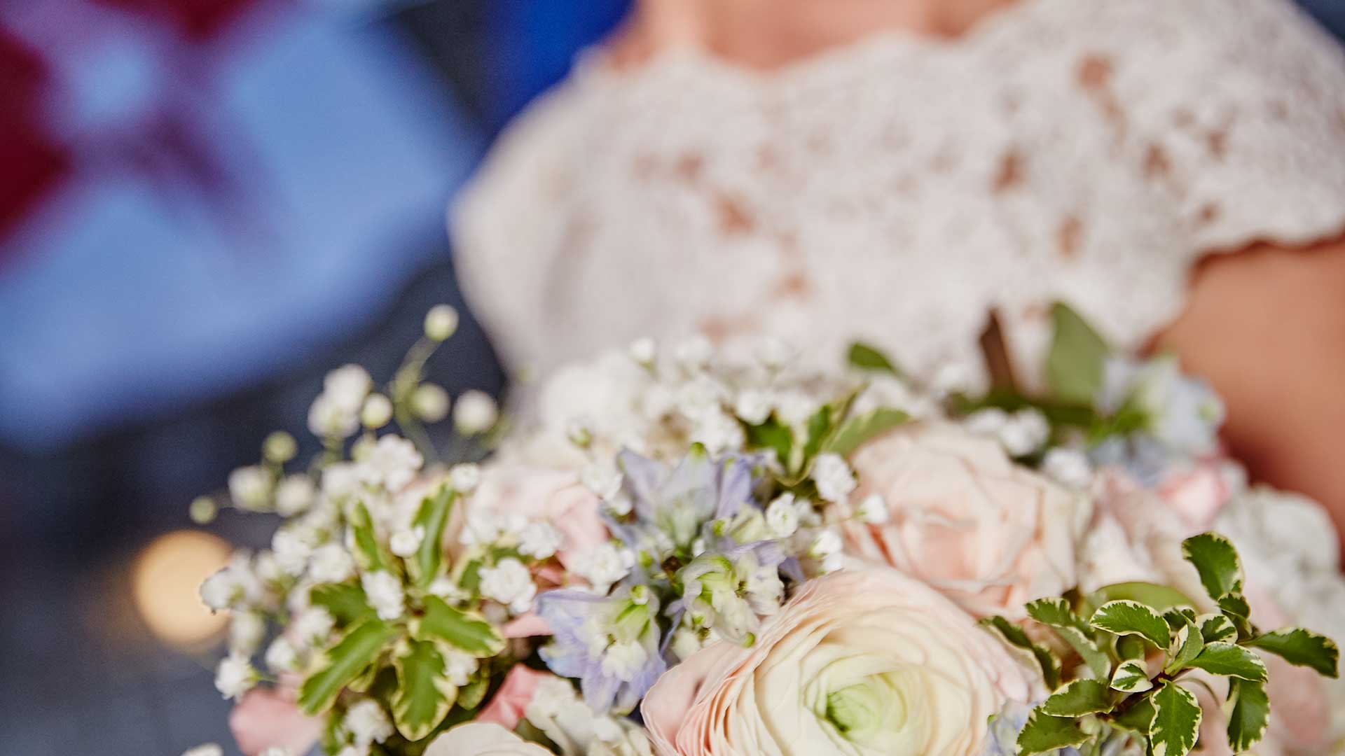
“Anchor your love” on board a ship of the DDSG Blue Danube. Special occasions deserve a special setting, an extraordinary location. We offer an incomparable backdrop for the most beautiful day of your life. We decorate the ship for your special day and elegantly cover the tables with napkins and floral decorations in the desired color.
Unforgettable moments on the ship
Maritime flair and a special atmosphere
A unique experience in the middle of the Danube metropolis

FULL CHARTER
Your dream wedding on a boat could look like this (example)
5:30 PM – 6:00 PM | ENTRY & RECEPTION
Welcome your guests in the middle of the city center at Schwedenplatz in Vienna and start the evening with a sparkling aperitif and delicious finger food on the open deck!
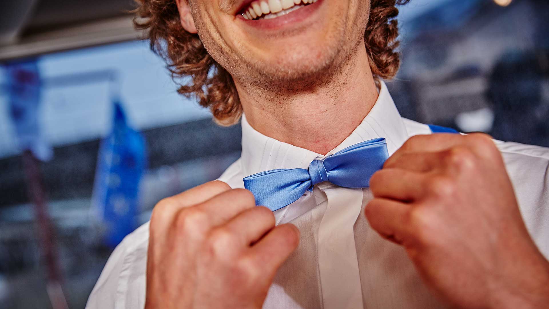
6:00 – 7:00 P.M. | WEDDING CEREMONY
The registrar comes on board and conducts the wedding ceremony on the anchored ship (duration: approx. 30 minutes, not included in the price).
7:00 PM – 10:00 PM | SHIPPING
“Cast off!” – You cast off into the harbor of marriage. The 3 to 3.5-hour
cruise takes you along the Viennese scenery on the Danube Canal or the
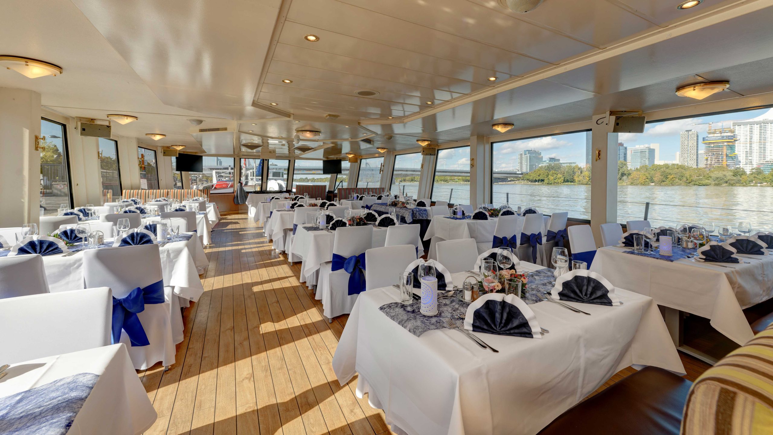
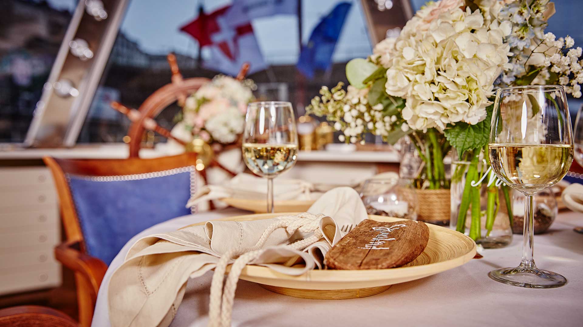
Danube towards the sunset. Guests take a seat at one of the
lovingly decorated tables. The on-board gastronomy spoils you with a
delicious buffet and conjures up culinary moments of happiness on board. Thanks to
the on-board infrastructure, you can play your favorite music or a
live band or DJ will create the right atmosphere.
10:00 PM – 11:00 PM | END
The evening ends at the moored ship.
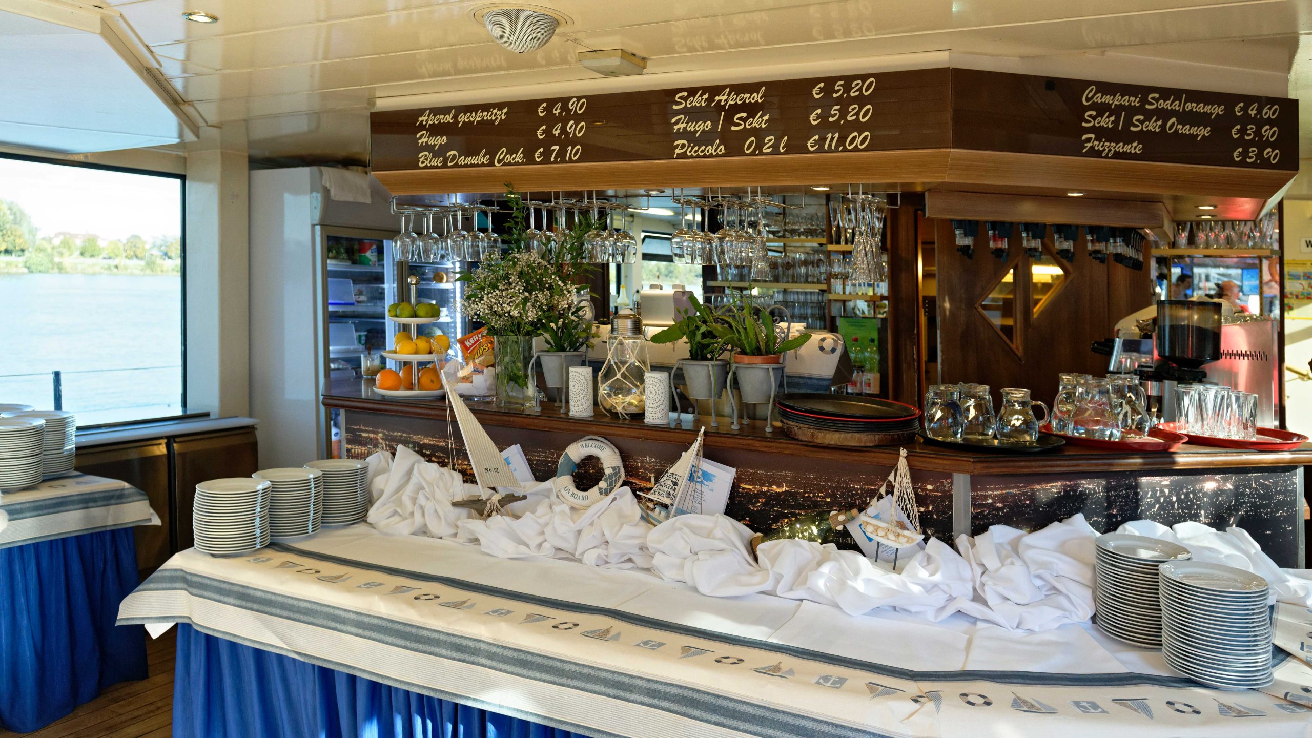
WEDDING PACKAGE ON-BOARD GASTRONOMY
THE ON-BOARD CATERING MAIA & ROMAN LOOS
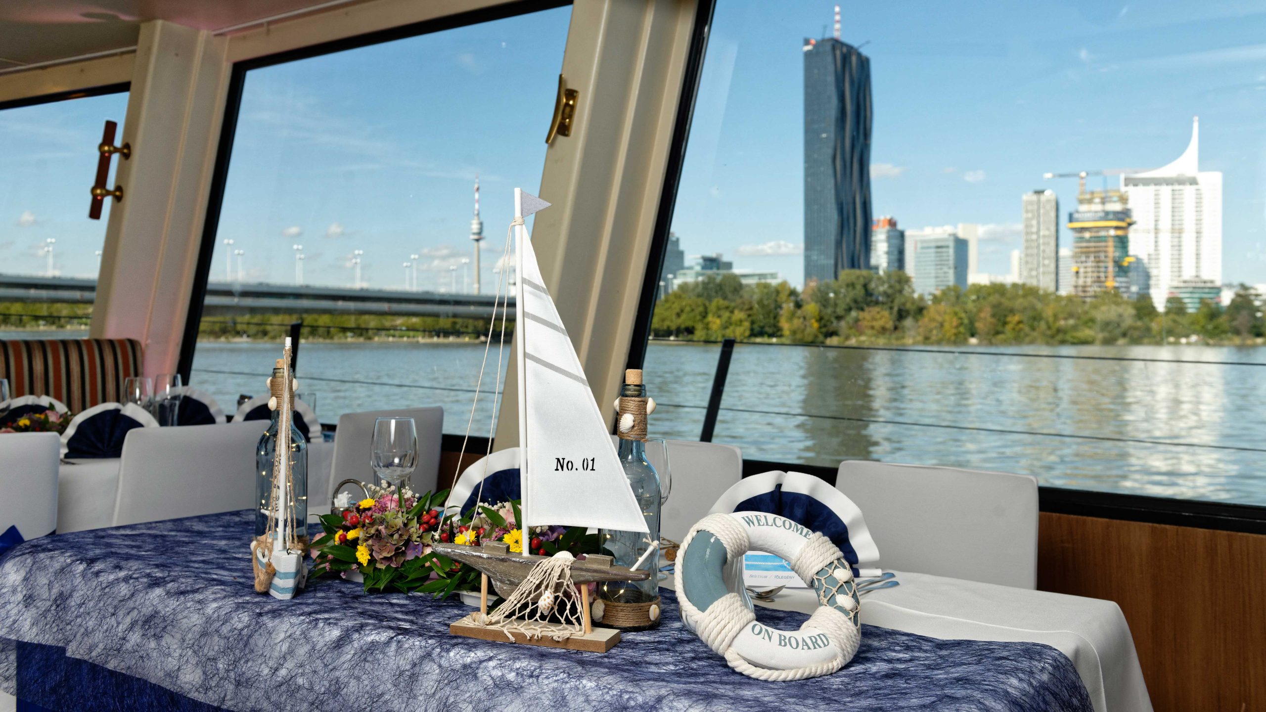
We decorate the ship for your special day and elegantly cover the tables with napkins and floral decorations in the desired color.
WEDDING PACKAGE VIENNA
‘ Aperitif
‘ Wedding menu or wedding buffet
‘ Place settings
‘ Flower arrangements at the table
‘ Menu or buffet cards
‘ 4-hour drinks service:
– Open wine: Blauer Portugieser & Grüner Veltliner from the Bayer winery
– Kaiser beer: 0.5 l and 0.3 l
– Non-alcoholic drinks: cola, Fanta, Almdudler, orange juice, apple juice, soda water, still water
– Coffee, tea
The costs for the wedding package are not included in the rental price of the ship and must be paid separately. Offer only valid for MS Wien, MS Vindobona and MS Blue Danube. For parties of less than 50 persons: 15 % surcharge
WEDDING BY VIENNA REGULATORY OFFICERS
In any case, please contact the desired registry office in advance in order to check your desired date for free capacities on the part of the registry office.
Municipal Department 63 – Unit “Dream Wedding in Vienna”.
www.wien.gv.at/verwaltung/habenwesen/ehe/traumhochzeit/fluss-kosten.html
The costs for the wedding on board are not included in the rental price of the ship and must be requested and paid separately at the registry office.
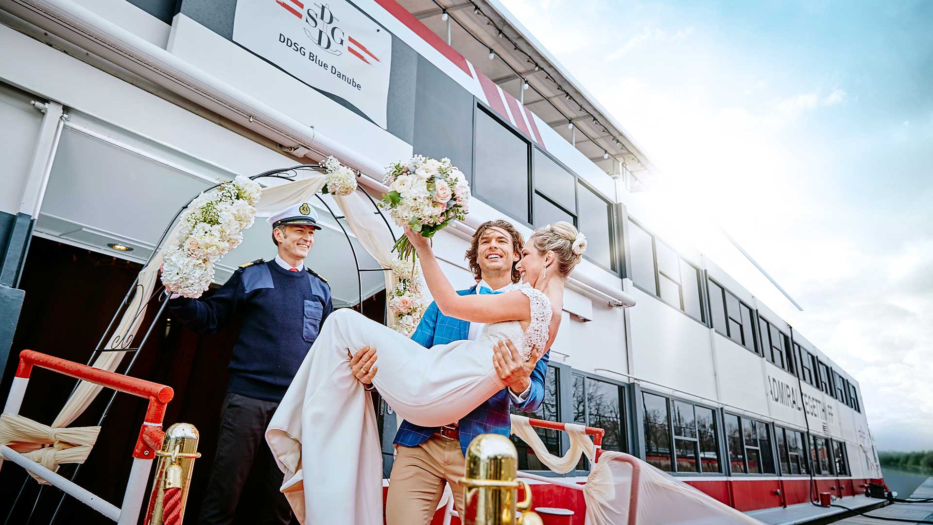
Into the harbor of marriage
Your dream wedding on Danube waves | 365 days a year
“Anchor your love” on board a DDSG Blue Danube ship
THE DDSG BLUE DANUBE FLEET
In Vienna

MS VIENNA
Get to know the Viennese scenery with the city ship for trendsetters
Special features: Flexible seating, modern interior, weatherproof open-air deck

MS VINDOBONA
Experience an original Viennese boat trip on the Hundertwasser ship
Special features: Artistic design by Friedensreich Hundertwasser, large dance floor

MS BLUE DANUBE
The “little Maritime” in year-round use in the Danube Canal and on the Danube
Special features: Special flair thanks to loving decorative details, maritime furnishings, exclusive salon on the upper deck
WE ARE HAPPY TO ADVISE YOU!
The charter team accompanies you from the development of your idea through the planning and organization to the implementation of your event and ensures that your event runs smoothly and successfully
DDSG Blue Danube Schiffahrt GmbH
1020 Vienna, Handelskai 265
Tel: +43 1 588 80 – 442
E-Mail: charter@ddsg-blue-danube.at
We would be happy to advise you personally at a pre-arranged appointment or during a tour of the ship!
Discover the “Queen among Europe’s rivers” with the DDSG Blue Danube. The Danube is the most sung about river, it crosses a world cultural heritage, glides majestically between vineyards, breaks through rock massifs, offers imaginative views and a lot of variety. For the curious and first-time visitors as well as for “repeat offenders” and connoisseurs.